Widgets play a key role in flutter layout where everything is a widget. Text and images are widgets but something you don’t see in a Flutter app is also widgets e.g, rows and columns, etc. Text and images are visible widgets whereas rows and columns are layout or invisible widgets.
Row Widget will have its children stacked in horizontal order.
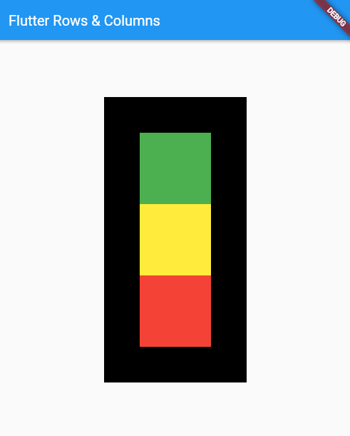
Column Widget will have its children stacked in vertical order.
To make our code easy to read and understand, we’ll create a new widget/file for the home argument of the MaterialApp() widget.
//File: main.dart
import 'package:flutter/material.dart';
import 'package:flutter_rows_columns/home.dart';

void main() => runApp(const HomePage());

class HomePage extends StatelessWidget {
  const HomePage({Key? key}) : super(key: key);

  @override
  Widget build(BuildContext context) {
    return const MaterialApp(title: "Flutter Rows & Columns", home: Home());
  }
}
//File: home.dart
import 'package:flutter/material.dart';
class Home extends StatelessWidget {
const Home({super.key});
@override
Widget build(BuildContext context) {
return Scaffold(
appBar: AppBar(
title: const Text("Flutter Rows & Columns"),
),
body: Padding(
padding: const EdgeInsets.all(8.0),
child: Align(
alignment: Alignment.center,
child: Container(
color: Colors.black,
//width: MediaQuery.of(context).size.width,
//height: MediaQuery.of(context).size.height,
width: 200,
height: 400,
child: Padding(
padding: const EdgeInsets.all(8.0),
child: Column(
mainAxisAlignment: MainAxisAlignment.center,
crossAxisAlignment: CrossAxisAlignment.center,
children: [
Container(
padding: const EdgeInsets.all(8.0),
width: 100,
height: 100,
color: Colors.green,
),
Container(
padding: const EdgeInsets.all(8.0),
width: 100,
height: 100,
color: Colors.yellow,
),
Container(
padding: const EdgeInsets.all(8.0),
width: 100,
height: 100,
color: Colors.red,
),
],
),
),
),
),
),
);
}
}
Let’s change the width and height of the main container widget and use Row Widget instead of Column widget.
width: 400,
height: 200,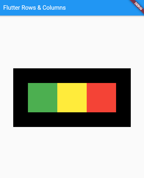


